Reference
Design System
Component inventory and brand reference. Everything available to build with.
Colors
Every color token from @theme static.
walnut
bg-walnut · text-walnut
#2D2520
copper
bg-copper · text-copper
#C2784A
gold
bg-gold · text-gold
#D4A853
cream
bg-cream · text-cream
#FAF7F2
warm-surface
bg-warm-surface
#F0EBE3
warm-muted
text-warm-muted
#8B7E74
Typography
Font families, sizes, and usage from the brand system.
Fraunces (heading)
Hero Heading
text-4xl sm:text-5xl lg:text-6xl · font-bold · leading-[1.08]
Section Heading
text-3xl sm:text-4xl lg:text-5xl · font-bold · leading-tight
Card Heading
text-2xl lg:text-3xl · font-bold
FAQ Question / Small Heading
text-xl · font-bold
Manrope (body)
Body copy. Manrope is used for all paragraph text, captions, navigation, and UI elements. It pairs cleanly with the editorial warmth of Fraunces headings.
text-base · leading-relaxed
Section Eyebrow
text-sm · font-medium · uppercase · tracking-[0.25em]
Button Text
text-sm · font-semibold · tracking-wide
Caption / Footer small print
text-xs
Components
Every reusable component in src/components/.
Atoms
SectionHeading
Eyebrow Label
A Section Title
Optional description text below the heading. This explains what the section is about in one or two sentences.
SectionHeading · src/components/SectionHeading.astro
Props: title, eyebrow, description, id, ornament (boolean) — all optional
Breadcrumb
Breadcrumb · src/components/Breadcrumb.astro
Props: items (array of { label: string; href?: string }). Includes schema.org BreadcrumbList JSON-LD.
FaqItem
FaqItem · src/components/FaqItem.astro
Props: id (required), question (required). Slot: answer content.
ServiceCard
OEM Manufacturing
Full garment construction from your tech packs across our 12 production lines. Jersey, cut & sew, sublimation printing, and embroidery — all under one roof.
- Jerseys, Kits & Teamwear
- T-Shirts, Polos & Hoodies
- Outerwear, Bottoms & Accessories
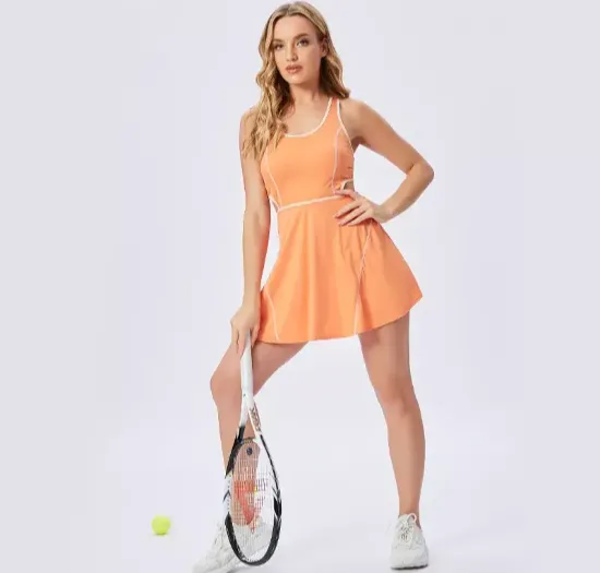
ServiceCard · src/components/ServiceCard.astro
Props: number, title, description, image, imageAlt, items (string[]), imageLeft (boolean)
FabricCard
Moisture-Wicking
Engineered polyester blends that pull sweat away from skin — essential for gym, running, and team sports.
FabricCard · src/components/FabricCard.astro
Props: number, title, description, tags (string[])
StatBadge
StatBadge · src/components/StatBadge.astro
Props: value (string), label (string)
CertificationBadge
ISO 9001 Certified
Our quality management system is independently audited. Process consistency and traceability you can rely on.
CertificationBadge · src/components/CertificationBadge.astro
Props: label, title, description, variant ("gold" | "copper")
ScenarioCard
Startup Brands
Launch your first collection with low minimums and fast sampling. A partner who helps you navigate production from concept to delivery.
ScenarioCard · src/components/ScenarioCard.astro
Props: title, description, icon (SVG path), href (optional)
ProcessStep
Share Your Brief
Tell us about your brand, your target customer, and your product vision. Share reference images, sketches, or existing samples.
ProcessStep · src/components/ProcessStep.astro
Props: step (string), title, description
DecisionStep
Demo Step Title
Optional tagline text.
The Problem
The buyer pain goes here — what the person ordering uniforms is struggling with right now.
Procurement Insight
The procurement insight explains why this problem exists in the industry.
What to Look For
- Size-run fit sample
- “Can you produce a complete size-run fit sample?”
- Graded placement
- “Are size grades taken from the actual fit sample?”
Check-Off List
- Full size-run fit sample, cut to my roster
- Fit sample approved before bulk cutting
DecisionStep · src/components/DecisionStep.astro
Props: id, step, title, tagline?, problem, insight, solutionTitle?, solutionBody (HTML), askList? ({label, question}[]), checklist (string[]), cardEyebrow?, cardTitle, cardHref?, cardLinkLabel?
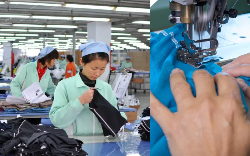
CaseStudyCard · src/components/CaseStudyCard.astro
Props: post (collection entry with id and data), featured (boolean, default false). Auto-extracts metrics from title for badge display.
HighlightsPanel
HighlightsPanel · src/components/HighlightsPanel.astro
Props: highlights (array of {metric, label}). Displays key metrics in a data panel below the case study hero.
BlogCard · src/components/BlogCard.astro
Props: post (collection entry with id and data), size ("default" | "large")
AuthorBio

Li Wei
Li Wei has spent over 12 years on the factory floor in China, working directly with brands from 20+ countries.
AuthorBio · src/components/AuthorBio.astro
Props: name, bio, avatar (optional)
Pagination
Pagination · src/components/Pagination.astro
Props: currentPage, totalPages, baseUrl (default: "/blog")